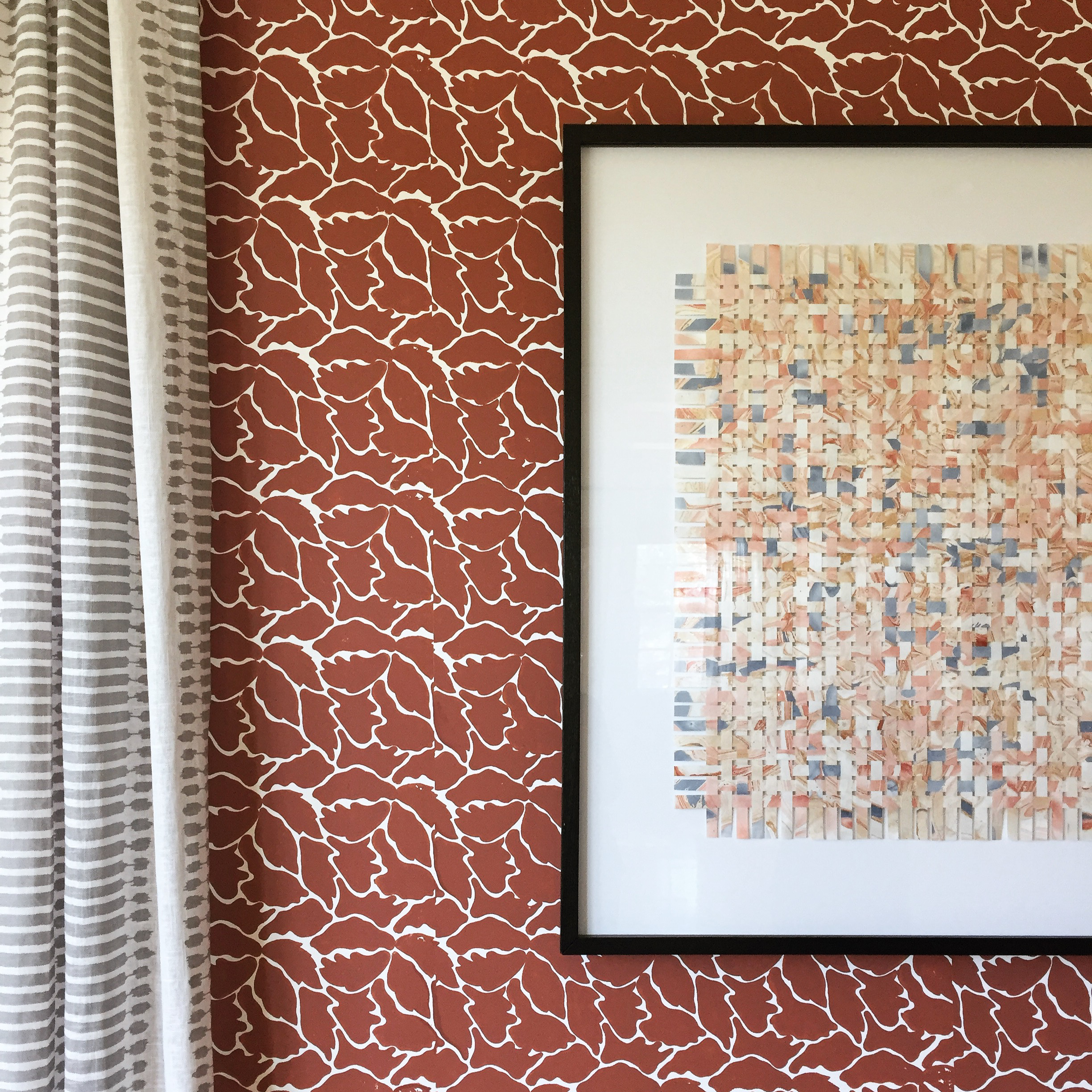
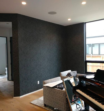
In an interesting turn of events, Sir Peter Osborne has all “dove-grey walls and white linen curtains in every room.” Given that he represents all that is pattern and color, that will have to change.
Casting off the traditional path of banking and stockbroking, Osborne partnered with his brother-in-law Antony Little, both 25-years old at the time, and started their individual roles of design and business in a pursuit of statement-making fabrics and wallpapers. That was 50 years ago, in 1968, when it was creating backdrops to the sixties-era bubble chairs and shaggy carpets. Graphic designer, Little, has retired since. They’ve come a long way too. To celebrate the mid-centennial, an extravagant cake was adorned with baubles and color-happy wallpaper patterns for the announcement of their 50th spring collection. The avant-garde approach to advertising is a signature move for Osborne and Little, beginning in the 1980s when they waved an easy interior couch and pillow scene for surreal metallic beetles against bamboo or a pack of puppies in plaid. As a rule, they’ve been ahead of their time since, until today when they seem to be having a moment right now.
Early on Osborne and Little identified a need for exciting designs where the 1960s offerings were about as exciting as an oatmeal breakfast. What they came to the market with were leaping tigers and mint-green hoops; for example. A bit zippier than the Lincrusta, William Morris alternative.
If you’ve traveled to the uber-trendy Chelsea neighborhood in London, you’d find a worthwhile field trip to the Osborne & Little boutique shop. Then, round the corner on Knightsbridge, the infamous Nina Campbell store selling her home goods and gifts. For more on Nina Campbell and her exclusive designs for Osborne and Little, design aesthetic, and when to specify her, like member Jennifer Haigler, see our latest wallcovering designer spotlight.
The Latest Osborne and Little Collections
New Collection: Manarola Wallpapers

New Collection: Lucenta Vinyls
Turn to the Lucenta Vinyls line for both contemporary commercial spaces and demure domestic interiors. This collection is a sophisticated-fancy full of nuance and detail for added design layering to any room. From an unexpected replication of patterned lizard skin in 11 colors to a mesmerizing eight shades of narrow monotone stripes this collection makes for a more refined palette with a hint of glitz. In fact, the name Lucenta derives from Italian heritage meaning brilliant, bright, and shining.
Autumn 2017 Collection: Les Reves
A bit more hand-crafted, DIY, and dollhouse-finesse is this collection under the Osborne and Little name, Les Reves. The designs are perfect in their imperfections as seen in the Beau Rivage series where spots and wavy lines mimic watercolor edges in six colorways. Domiers gets its name from a gathering of artists that would collect at the Cafe de Dome and is equally, while monochromatic, Wes Anderson-esque in its craftiness. Nina Campbell has a way of making a space feel unique and shines in this collection for Osborne and Little where inspiration can come as far and wide as a Mediterranean coastal town, to a gaggle of creatives meeting for interesting banter. This collection is great for beginners too; all of the designs are printed on an easy-to-hang non-woven base.
Belvoir Wallpapers

Enchanted Gardens Wallpapers
In another collection of easy-to-hang non-woven base wallpaper materials, the designer is inspired by a garden and woodland scenes while weaving in matte and metallics to level up the already provocative patterns. From more abstract driftwood, cedar, and fresco shadings, the room is enshrined in stained aged floorboards or vertical wooden planks. These make up the more unassuming aspects of the collection. On the other end of the spectrum is a smattering of graphic butterflies layered over an orchard of roses that comes digitally printed. Further, as if taken from the inside of a summer novel, are the flattened leaves and petals collected on a forest floor and placed over a metallic backdrop. Finally, in more graphic detail are vibrant bamboo shoots, blooms and birds plucked from the rainforest and unrestrained garden scenes.
Coromandel Wallpapers
In another Nina Campbell collection, we are given something for the history and geography scholar. Campbell covers continents, periods of history, and creates the conversation in the contemporary international interior. In a maude-abstract take on the Mona Lisa, Campbell somehow taps into the Gatsby-themed colors scheme and makes it her own by tying in a bit of art history. While the collection includes intricate flower arrangements, she somehow makes them unique with little surprises like crayon-inspired finishes.
Durbar Wallpapers
Enter the Johnny Depp of fabric, fashion, and design, Matthew Williamson. The British designer behind this collection is no stranger to vibrant color and contemporary shapes. We especially like the architectural peacock feathers in the monochrome metallic “Atari” series, but also can’t get the Narissa digitally-printed paper of “framed butterflies and Indian artifacts” out of our minds. If you haven’t heard of Williamson before, his striking eyes you won’t soon forget, stay tuned. We might need to do a deep dive into his design aesthetic and other wallcovering collaborations.
Weaving in Osborne & Little Wallcoverings
There’s nothing that can replace real insight into how to hang foils, vinyl, and self-proclaimed easy-to-hang nonwovens like in nearly all of the Osborne and Little collections we covered. Each collection from Osborne and Little packs a punch with name brand, world-renowned designers, and collaborations. Hanging the types of graphic, of-the-moment metallics, and scenes from Osborne and Little has the power to elevate your paper installation career to the next level.
You have the opportunity to be together with the most senior and seasoned wallcovering installers under one roof this September in Denver, Colorado at the Unconventional Convention. We’ve also recently rolled out the latest seven sessions we’ve added, the speakers, and highlighted the opportunities for you to gain new skills in real time with live question and answer sessions. Hurry, check out the latest sessions now and don’t miss a chance to make the connections you’ll need now, in 2019, and beyond.


